
24 October, 2023
Branding Beyond Logos: Convey Brand Ethos Through Designs & Aesthetics
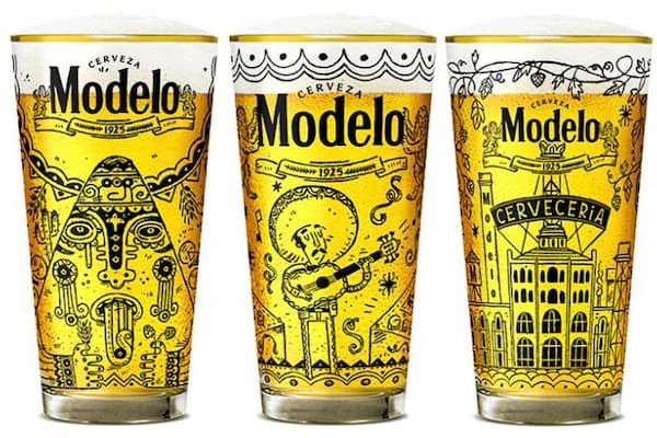
Traditionally, branding has relied heavily on the power of logos and names to create a lasting impression and foster recognition among consumers. But as the landscape of consumer experience evolves, so do branding strategies. Companies are now turning to more subtle and innovative ways to convey their brand identity. One emerging trend is branding without the use of logos or names, relying solely on designs and aesthetics. This approach can be particularly effective for merchandise like glassware and custom wine glasses, where the form and functionality naturally lend themselves to creative design.
Colour Psychology: The Language of Hue
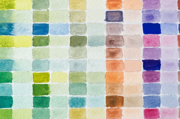
Colour is more than a decorative element; it is a powerful communicator. In branding, the strategic use of colour can convey messages and emotions more potently than words or even logos. Particularly when branding merchandise such as glassware, it can be used creatively to embody a brand's ethos without explicitly using names or symbols. Brands can tap into the psychology of colour to imprint their identity onto glassware compellingly and memorably.
Colours have long been associated with specific moods, feelings, and even physiological responses. For example, blue is often linked to calmness and reliability, while red is associated with excitement and passion. This understanding is grounded in colour psychology, a study that examines how different hues can impact human behaviour and decision-making. By understanding these associations, brands can choose colours that align with their values and desired public image.
Luxury and Elegance
The colour palette should reflect if the brand's persona is steeped in luxury and sophistication. Deep, rich colours like burgundy, emerald green, or royal blue resonate with opulence and grandeur. When used on glassware, they can elevate the item's perceived value. A set of burgundy wine glasses or emerald green tumblers could instantly evoke a sense of prestige, aligning the consumer's experience with the brand's luxurious identity.
Sustainability and Eco-Friendliness
Earthy tones are an excellent choice for brands focusing on sustainability and eco-friendliness. Colours such as forest green, sandy beige, or sky blue connect with nature and convey a sense of responsibility towards the environment. When these are used in branding glassware, they implicitly communicate the brand's commitment to sustainable practices, attracting like-minded consumers.
High-Energy
Brands that want to convey excitement, youthfulness, or creativity often turn to vibrant colours like bright yellow, electric blue, or hot pink. Glassware in these colours can be a lively addition to social gatherings, reflecting the brand's energetic and outgoing ethos.
Neutral Tones
For a broad appeal, neutral tones like white, grey, or black can be incredibly effective. These signify versatility and can fit into various settings, from casual to formal. Moreover, neutral-coloured glassware can be seen as timeless, aligning with brands that emphasize durability and long-term value.
Color Harmony
Selecting one colour is a start, but creating a harmonious palette can amplify the branding message. Combining complementary or analogous colours can create a visual experience that resonates more deeply with the consumer. For example, a brand that focuses on luxury might pair gold accents with a deep blue base, increasing the aesthetic appeal and reinforcing its luxurious image.
Consistency
Consistency in the chosen colour scheme across various products and platforms can fortify brand recognition. When a customer sees glassware in a specific shade of green that they associate with a brand's commitment to sustainability, the connection is instant and emotional. Over time, the colour itself becomes synonymous with the brand's core values.
Shapes and Patterns: Intricacy and Meaning
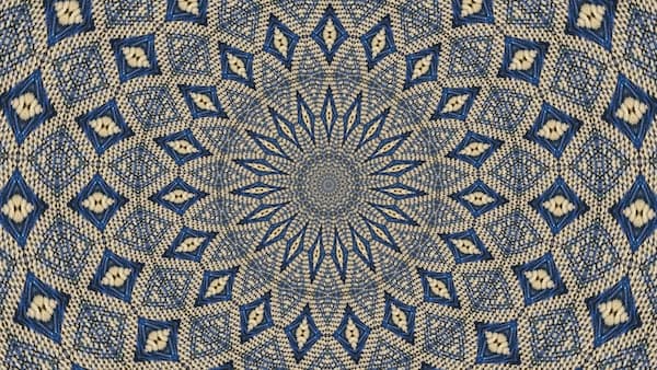
While colour is often the first thing that catches the eye, shapes and patterns are the elements that hold the viewer's attention and convey deeper meaning. In the context of branding glassware, the design can go beyond mere aesthetics to serve as a visual language that communicates a brand's core values and ethos. The possibilities are endless from clean, geometric lines that represent reliability to intricate patterns signifying attention to detail.
The Psychology
Understanding the psychological implications of different shapes and patterns can provide a foundation for effective design. For example, geometric shapes like squares and triangles are often associated with structure and stability, while organic, free-form shapes evoke a sense of freedom and creativity. By incorporating these elements into glassware design, brands can create products that resonate visually and emotionally.
Geometric Designs
For brands that want to emphasise their reliability and structure, geometric designs can be an excellent choice. A simple grid or a repetitive pattern of triangles can convey a sense of stability and precision. Imagine a set of whiskey glasses etched with a sophisticated grid pattern—such a design instantly communicates a brand ethos rooted in orderliness and quality.
Organic Shapes
Brands that champion creativity, innovation, or flexibility may find that organic shapes better represent their values. Fluid lines and curves can make the glassware look dynamic and adaptable. For instance, a brand focused on artistic expression might design wine glasses featuring swirling patterns, subtly conveying a sense of creativity and movement that aligns with its ethos.
Artisanal and Luxury Brands
Intricate designs are often a hallmark of luxury and artisanal brands, as they signify a high level of craftsmanship and attention to detail. Floral patterns, intricate latticework, or complex geometric designs can be etched onto the glassware to make the piece feel like a work of art. This resonates with consumers who appreciate the finer things in life and are willing to pay for that extra touch of elegance.
Cultural and Thematic Patterns
Patterns can also serve as cultural or thematic markers, resonating with particular consumer demographics or interests. A brand that wants to evoke a specific cultural heritage might use traditional motifs in its glassware designs, like Nordic patterns or Japanese cherry blossoms. Such designs can establish a strong emotional connection with consumers who identify with these themes.
Colour and Pattern
While this article focuses on shapes and patterns, it's worth mentioning that these elements often work best when thoughtfully combined with colour. The choice of hue can reinforce the messages conveyed by the shapes and patterns, creating a more cohesive and effective design. For example, a monochrome colour scheme might accentuate a geometric pattern, emphasizing the brand's focus on reliability and structure.
Consistency
Maintaining a consistent use of shapes and patterns across different types of glassware—or even across different branding materials—can help establish a stronger brand identity. Over time, the recurring shapes and patterns become directly associated with the brand, much like a logo or color scheme would.
Texture: A Tangible Connection

The tactile experience of physically touching a product has become more important than ever in shaping consumer perceptions. When it comes to glassware, texture can elevate a simple object into a multi-sensory experience, serving as a physical manifestation of a brand's ethos. Whether aiming for the aura of luxury, the charm of authenticity, or the coziness of comfort, the texture can be a powerful medium for brands to engage consumers on a tactile level.
Psychological Impact
Texture, like colour and shape, has psychological connotations that can evoke specific emotional responses. Smooth textures are often associated with luxury, sophistication, and modernity. In contrast, rough or textured surfaces can evoke feelings of rustic charm, authenticity, and warmth. By understanding these psychological cues, brands can deliberately employ different textures to align with their ethos.
Smooth and Flawless
A smooth, flawless finish on their glassware can be highly effective for brands that wish to position themselves in the luxury or high-end market. Imagine holding a crystal-clear wine glass with a perfectly smooth surface—it immediately elevates the experience and gives off an air of sophistication. Such textural attributes communicate the brand's commitment to excellence and meticulous attention to detail, attracting consumers who seek refinement in their lifestyle choices.
Rugged and Artisanal
A more textured approach can be equally impactful for brands focusing on artisanal quality or authenticity. Glassware with a handmade, slightly uneven texture can offer a tactile experience that resonates with the brand’s commitment to craftsmanship. The subtle irregularities in such pieces can make them feel unique and authentic, capturing the hearts of consumers who value individuality and the human touch in the products they buy.
Mixed Textures
Brands aiming for a versatile appeal may opt for a mix of textures in their glassware line. For instance, a set of drinking glasses may feature smooth inner walls for practical use, while the exterior might have a textured or frosted finish for an enhanced grip and aesthetic appeal. This can communicate a brand's focus on both function and form, reaching a broader audience by catering to various preferences.
Soft Textures
Although glassware is predominantly hard by nature, incorporating soft textures in silicone grips or padded bases could convey a sense of comfort. This approach aligns well with brands that promote a relaxed, comforting lifestyle, making their glassware a utility and tactile comfort object.
Consistency
Just as with colour and pattern, maintaining textural consistency across different types of glassware can aid in building a more cohesive brand image. When consumers recognise a specific texture as characteristic of a particular brand, that tactile experience becomes a potent branding element that can drive both recognition and loyalty.
Thematic Consistency: Telling a Story

Storytelling has emerged as a powerful tool to differentiate a brand and foster a deeper emotional connection with consumers. For brands specialising in products like glassware, the challenge often lies in conveying their narrative without the use of extensive written content or interactive media. One potent strategy for achieving this is through thematic consistency in design elements. By maintaining a consistent theme across a range of products, brands can offer consumers a more immersive and meaningful experience, inviting them into a 'brand universe' that resonates with their ethos and values.
The Importance
Stories are deeply ingrained in human culture and psychology. They serve as a way to make sense of the world, and when done well, a good story can evoke emotions and forge connections. Brands that manage to weave a compelling story into their products capture attention and earn loyalty. That loyalty often stems from the consumer's emotional engagement with what it represents, which becomes more potent when the theme is consistent across different offerings.
Eco-Friendly Narratives
For brands with a focus on sustainability and environmental consciousness, a nature-inspired theme can create a strong emotional resonance with like-minded consumers. Glassware featuring designs of leaves, waves, or even abstract interpretations of natural elements, can subtly convey a commitment to eco-friendly practices. The theme here isn't just decorative; it's a chapter in a larger story about respect for the environment, making the act of drinking from such a glass a more meaningful experience.
Retro Designs
Brands that aim to evoke a sense of nostalgia can employ retro themes consistently across their glassware line. Whether it's the geometric patterns of the '70s, the pastel colour schemes of the '50s, or even art deco motifs, such themes take consumers on a trip down memory lane. They also enable the brand to tell a story that capitalizes on the emotive power of nostalgia, building a unique narrative around their products that transcends the simple functionality of glassware.
Unified Experience
Thematic consistency is not just about having the same pattern or colour scheme across all products. It also involves harmonising other design elements like shape, texture, and even packaging to create a unified brand experience. For instance, a brand focusing on a luxury theme might opt for glassware with gold accents, intricately etched designs, and velvet-lined packaging. Each element contributes to the overall story of opulence and attention to detail.
Subtlety
The beauty of thematic consistency lies in its subtlety. While logos and brand names make direct identifiers, a well-executed theme can be a softer, more implicit way of stamping a brand’s identity onto a product. It’s a way to immerse consumers in the brand's universe without the need for overt brand mentions. Over time, the theme itself becomes strongly associated with the brand, serving as an alternative yet effective form of brand recognition.
Functionality as Design: Purpose in Aesthetics
In the context of glassware, brands can find a unique positioning strategy by making the very functionality of the item an integral part of their design ethos. For brands that stand for innovation, practicality, or problem-solving, incorporating novel features into the glassware not only enhances its utility but also serves as an embodiment of the brand's core values.
Beyond the Obvious
When we think of glassware, its basic functionality—holding liquids—might seem straightforward and unchangeable. However, a closer look reveals numerous opportunities for innovation that can improve the user experience. For example, an ergonomic grip can make the glass more comfortable to hold, or a built-in measurement scale can turn a simple glass into a versatile kitchen tool. These features add value to the product and become talking points that set the brand apart in a crowded market.
Ergonomic Design
Brands that prioritise user comfort and well-being can use ergonomic design as an expression of their core ethos. Imagine a glass with a uniquely contoured grip that reduces hand fatigue, perfect for those who may be holding it for extended periods. This design feature directly speaks to the brand's focus on user-centric solutions. Over time, consumers will start associating the ergonomic design with the brand itself, recognizing its commitment to enhancing comfort in everyday life.
Measurement Scales
For brands that stand for efficiency and practicality, including a built-in measurement scale in the glassware can be a game-changer. Whether it's for mixing drinks or measuring portions, a simple scale turns the glassware into a multi-functional tool. Such a practical feature aligns perfectly with a brand ethos centred on problem-solving and efficiency, creating a design that serves multiple purposes without compromising on aesthetics.
Innovative Features
Incorporating functionality into design doesn't just benefit the consumer; it can also create a ripple effect that boosts other aspects of the brand. Retailers may be more likely to stock a product that offers something new and useful, while online reviews highlighting the innovative features can help drive sales. As users share their positive experiences, word-of-mouth can contribute to building a brand image that is synonymous with innovation and practical solutions.
Distinguishing the Brand
While overt branding elements like logos and names play an essential role in brand recognition, functionality-based design offers a more subtle yet powerful form of branding. Every time consumers use the feature—be it an ergonomic grip or a built-in scale—they are reminded of the brand's ethos of problem-solving and innovation. This continuous reinforcement can build a lasting relationship between the brand and its consumers based on aesthetic appeal and tangible, functional benefits.
Emphasising Quality: The Material Speaks

One of the most direct ways to emphasise quality is through material selection, a factor that often speaks louder than any label or marketing tagline. For brands in the glassware industry, the choice of material can be a potent symbol of the brand's ethos, whether that's sustainability, luxury, or any other core value.
Sustainability Through Material
In an age where eco-consciousness is not just a trend but a necessity, the choice of using recycled or sustainable materials for glassware can make a powerful statement. Brands incorporating eco-friendly materials such as recycled glass or sustainably harvested wood for cork stoppers send a message about their commitment to the planet. The material physically embodies the brand’s environmental stewardship, creating an immediate connection with eco-conscious consumers. Over time, the material becomes as synonymous with the brand as any logo, serving as a tangible expression of its core values.
Luxury Defined by Crystal
On the other end of the spectrum are luxury brands that choose high-end materials like crystal for their glassware. Crystal is often associated with sophistication, elegance, and a certain timeless quality. Brands that opt for such materials are making an unspoken but resounding statement about the kind of luxury and quality they represent. The very act of holding a crystal glass can evoke feelings of refinement and exclusivity, aligning perfectly with a brand ethos centred around opulence and high-quality craftsmanship.
Innovation
Some brands may opt for modern, innovative materials with unique functionalities, like temperature retention or enhanced durability. Brands focusing on innovation and practicality might select more durable materials or offer thermal insulation. This aligns with a modern, practical ethos that values longevity and user-friendly features. Consumers immediately associate the brand with innovative problem-solving when encountering this material choice.
Transparency and Purity
Glassware brands emphasising purity and simplicity may choose materials that are free from lead or other contaminants. The transparency and purity of the material resonate with consumers looking for natural, uncomplicated quality. It reflects the brand's commitment to offering straightforward, clean, and healthy options, reinforcing its simplicity and purity ethos.
Material
Beyond functionality and eco-consciousness, the material's aesthetic quality—its colour, texture, and translucence—can also play into the brand's image. Matte finishes may express a modern, minimalist vibe, while intricate, hand-blown glass may convey an artisanal, handmade ethos. The material's aesthetics provide yet another layer of communication between the brand and its consumers.
Limited Editions: Scarcity and Exclusivity
Limited editions can be a powerful tool for communicating brand values such as innovation, exclusivity, and dynamism.
The Psychology of Scarcity
The notion of scarcity—having something that not everyone else can possess—holds immense psychological power. Consumers often perceive scarce items as more valuable, elevating the product from a mere object to a status symbol or collector's item. Limited editions leverage this psychology by creating a sense of urgency around the product. The 'limited-time-only' or 'while supplies last' tags drive immediate sales and amplify the item's perceived value.
Building a Sense of Community
They can serve to commemorate significant events or milestones in the life of a brand, be it an anniversary, a historical moment, or a collaboration with a renowned designer. When consumers purchase these special editions, they often feel they are buying a piece of history or becoming part of an exclusive club. This sense of community and belonging can fortify brand loyalty and make consumers more likely to engage with the brand in the future.
Innovation
Releasing limited editions also allows a brand to showcase its innovative and dynamic nature. Constantly updating the product line with fresh, limited-run items can give the impression that the brand is ever-evolving, staying ahead of trends, and consistently offering something new and exciting. This aligns particularly well with brands that want to project an image of innovation and agility.
Social Media and Word-of-Mouth
The exclusivity and novelty often makes them highly shareable on social media. Consumers love to flaunt their 'limited edition' purchases, which acts as free advertising for the brand. This boosts the brand's visibility and generates a sense of FOMO (Fear of Missing Out) among other consumers, driving further interest and potential sales.
Striking a Balance
However, it's essential for brands to strike a balance when releasing them. Overdoing it can dilute the concept of 'exclusivity,' making each new release less special. Moreover, if not executed well, they can be seen as mere gimmicks, detracting from the brand's overall reputation for quality and innovation.
Beyond the Obvious
Branding is no longer confined to the realms of logos and names. As the market becomes increasingly saturated, standing out requires innovative approaches to establish brand identity. Glassware presents an exciting opportunity for companies to weave their ethos into everyday items, turning them into subtle yet powerful ambassadors of the brand. By focusing on colour, texture, shape, quality, and thematic consistency, brands can create pieces that resonate emotionally with consumers, transforming a simple piece of glassware into a tactile representation of the brand's soul.
The Glassware Only Team